
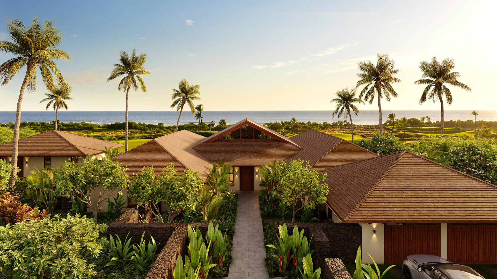
Dusk renderings can give an architectural proposal a clear evening setting. A residence photographed at the edge of night looks warm, grounded and alive. But daylight renderings carry real communicative power too. Choosing between them is not a matter of taste alone. It is a strategic decision that affects what a viewer understands, what materials read clearly and what story the image tells. This article walks through both lighting conditions side by side, so you can make that choice with confidence.
What Daylight and Dusk Renderings Actually Show
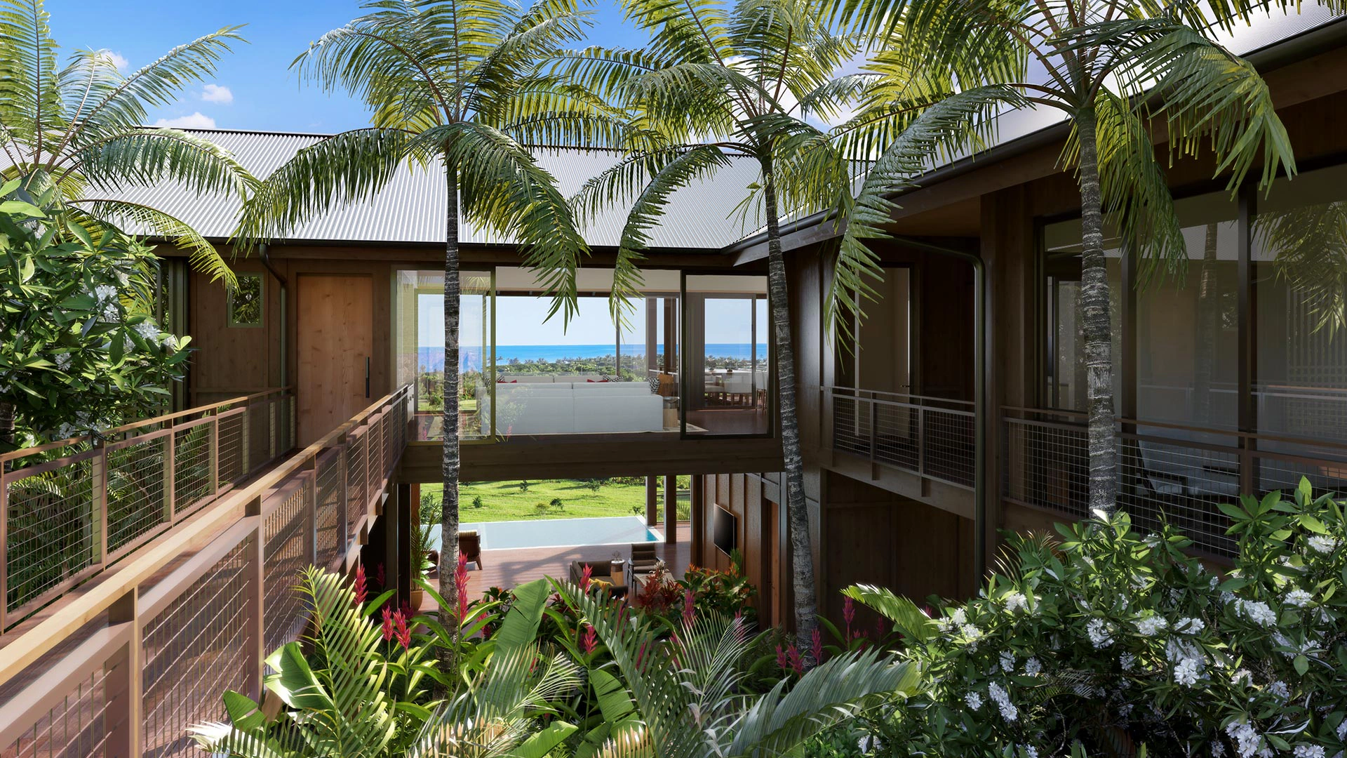
A daylight rendering works in the full spectrum of natural light. Sunlight rakes across textured surfaces. Shadow lines are crisp. Cladding can be easy to see, though the image still depends on the chosen light, exposure and display. Stone, wood and concrete show their grain and variation without any artificial warmth pulling attention. A viewer can assess proportions, setbacks, landscaping scale and the relationship between the building and its site. That can make the image useful for a design discussion.
A dusk rendering operates in a narrower window of time. The sky still carries ambient blue light. Interior lights are on and visible through glass. Exterior fixtures glow at a realistic level. The building reads as inhabited rather than designed. That shift in perception is the whole point. Dusk does not just look dramatic. It communicates occupancy, warmth and livability in a way that midday light rarely can.
Neither condition is more accurate. They are two different lenses on the same structure.
How Glass Behaves Differently at Each Hour
Glass is where the two lighting conditions diverge most sharply. In daylight, glass reflects the sky. From outside, windows often read as dark mirrors or bright patches of blue. The interior is largely invisible. That is realistic. It is also what happens in photographs taken during the day. An interior ceiling, staircase or furniture layout may be harder to see through glass in daylight. The result depends on the glazing, viewpoint and light on each side.
At dusk, the balance reverses. Interior light becomes brighter than exterior ambient light. The lit interior can become easier to see through the glass. The glass itself has not changed. Viewers can see into the space. A double-height living room reads through a curtain wall. A lit kitchen island becomes part of the facade composition. This interior-exterior exchange is one of the strongest arguments for dusk renderings on residential and hospitality projects.
The risk is exaggeration. A common mistake in dusk rendering is cranking interior brightness until windows blow out into flat white. That does not look inhabited. It looks like a paper lantern. Controlled interior lighting, with visible fixtures and realistic fall-off, produces a far more credible result.
Material Response Under Each Lighting Condition
Materials behave differently depending on where light comes from and how much of it there is.
Light-colored materials, such as white plaster or pale limestone, perform well in daylight. They show subtle texture variation and shadow detail. At dusk, those same materials can look flat or cold if they are not catching any warm artificial light from nearby fixtures.
Dark materials work the other way. A charcoal metal panel or dark brick can disappear into shadow at dusk if fixture placement is sparse. The same panel in full sun reads with depth and surface detail. Knowing this helps you decide which condition will serve the design better.
Warm materials, such as wood soffits, terracotta tile or bronze hardware, tend to read beautifully at dusk. Warm artificial light brings out their color temperature in a way that cooler daylight does not. If those materials are central to the design intent, dusk renderings are often worth considering.
Fixture Placement and Avoiding Exaggerated Glow
Realistic dusk renderings depend on fixture discipline. Every visible light source needs to behave like a real light source. That means it has a position, a color temperature, a beam spread and a falloff. Light does not emanate from nowhere.
Common fixture types in exterior dusk scenes include recessed downlights under soffits, step lights on pathways, landscape uplights on trees, pendant fixtures visible through glass, and wall sconces framing entry doors. Each of these contributes to the overall scene without dominating it.
The exaggerated glow problem appears when a renderer adds light as a mood effect rather than as a physical simulation. Halos around every window, bloom that eliminates detail, gradient washes with no identifiable source: these make a rendering look like a fantasy rather than a proposal. They also mislead clients and review boards about what a building will actually look like at night.
Restraint is the right instinct. A dusk rendering should look like a photograph taken at that hour, not a composite assembled to maximize drama.
A Hypothetical Comparison: Two Views of the Same House
Imagine a coastal residence with horizontal cedar cladding, a deep roof overhang, and a glass-walled living area facing the water. The architect wants one rendering to share with the planning board and a second for a real estate marketing package.
In this hypothetical example, the daylight version would show the overhang casting a clean shadow line across the cedar. The wood grain would be visible and the color true. The glass would reflect partial sky. The roof profile and massing would read clearly against a mid-morning sky. This version serves the planning board. It communicates the building as a physical object with a relationship to its site.
The dusk version of the same view would show the sky fading to a deep blue. The living area would glow through the glass wall, with a visible ceiling fixture and a lamp in the seating area. The cedar would catch warm light from a soffit fixture above the entry. Landscape uplights would define the tree canopy. The overhang, now in shadow, would frame the lit interior like a stage. This version serves the marketing package. It communicates how it feels to be in or near this house at the end of the day.
Neither image is more truthful than the other. They answer different questions.
Practical Checklist: Choosing Between Daylight and Dusk
Use this list before briefing your rendering studio.
- Who is the primary audience? Ask what each viewer needs to understand rather than assuming a preferred lighting style.
- Are interior spaces part of the story? Check how well they can be seen through the specified glazing in each version.
- Which materials are most important to the design? Light and pale materials read best in daylight. Warm and dark materials often read better at dusk with deliberate fixture placement.
- Does the project include meaningful exterior lighting design? Dusk is the only condition that shows it.
- Is the rendering part of a compliance or review package? Daylight is the safer choice for technical review. It avoids ambiguity about light levels or fixture intensity.
- Do you need only one image, or can you budget for both? A daylight and a dusk version of the same view often communicate more together than either does alone.
- What is the background sky doing in each condition? A dramatic cloudscape adds depth to daylight. A gradient dusk sky adds depth at the other end of the day. Neither should overpower the building.
When Both Conditions Make Sense Together
Some projects benefit from a paired set. A resort villa, a luxury spec home or a commercial mixed-use building might have renderings at multiple times of day specifically because different stakeholders need different things. The developer needs the daylight version for planning submissions. The sales team needs the dusk version for the launch brochure. Producing both from the same 3D model is efficient. The camera angle, landscaping, and model geometry are already resolved. Only the lighting environment changes.
This is worth discussing with your studio early. If you know you want both, that shapes how the model is built and how interior lighting is set up from the start.
It is also worth noting what dusk renderings are not. They are not daylight simulations in the technical sense. The U.S. Department of Energy describes daylighting as the use of natural light inside buildings to meet functional needs. A daylight performance study involves measurements and assumptions beyond the appearance of a rendered image. A marketing rendering, whether set at noon or dusk, is a visual communication tool. It does not substitute for a daylight analysis or energy simulation.
How This Fits With Your Other Visualization Decisions
Lighting condition is one decision among several when planning an exterior view. Camera height, distance, angle and lens choice all affect what a rendering communicates. You can discuss the range of still images and other formats through the studio’s architectural visualization services.
Your studio also needs complete drawing packages to set up lighting correctly. Interior fixture layouts, exterior lighting plans and ceiling details all inform how a dusk rendering is built. The article on what your rendering studio actually needs from your drawings covers that in practical terms.
For projects where a single still image is not enough, dusk lighting translates directly into animation and virtual tour contexts. A walkthrough rendered at dusk can show how light moves through a space as a viewer approaches the entry. Virtual tours can communicate that sequence in a way that a single frame cannot.
Making the Call on Your Current Project
The right lighting condition depends on the project type, the audience and the communication goal. There is no universal answer.
Daylight renderings can make form and surface detail easy to review. Dusk renderings show occupancy, reveal glass, flatter warm materials and carry emotional weight. Both are valid. Both serve real purposes. The mistake is choosing one by default without thinking through what the image needs to do.
If you are working on a project and want to think through which approach fits, or whether a paired set makes sense, the team at Jeff Brink Inc. is easy to reach. You can start that conversation at the contact page. Bring your drawings, a sense of your audience and the questions you need the rendering to answer. The lighting discussion follows from there.