

Why Material Review Matters Before Construction Begins
Interior architectural renderings give design teams a reliable way to review materials before a single finish is ordered or installed. That review is more nuanced than it might appear. A rendering is a computed image, not a physical sample. Understanding what it can and cannot show helps architects, interior designers, and developers use it well and make confident finish decisions.
Construction moves fast once it starts. Changing a stone veneer or a ceiling finish mid-project is expensive and slow. A visual review lets the team discuss changes before ordering finishes. The goal is not a perfect prediction of reality. The goal is a clear, shared picture of how materials will look together. The team can say yes, adjust, or try something else before anything is fabricated or installed.
Interior architectural renderings are well suited to this work. They can show grain scale, surface texture, sheen level, and color under a chosen lighting condition. They can place two or three finishes side by side in the same scene. The eye compares them naturally rather than flipping between swatches on a desk.
What Interior Architectural Renderings Can Actually Show
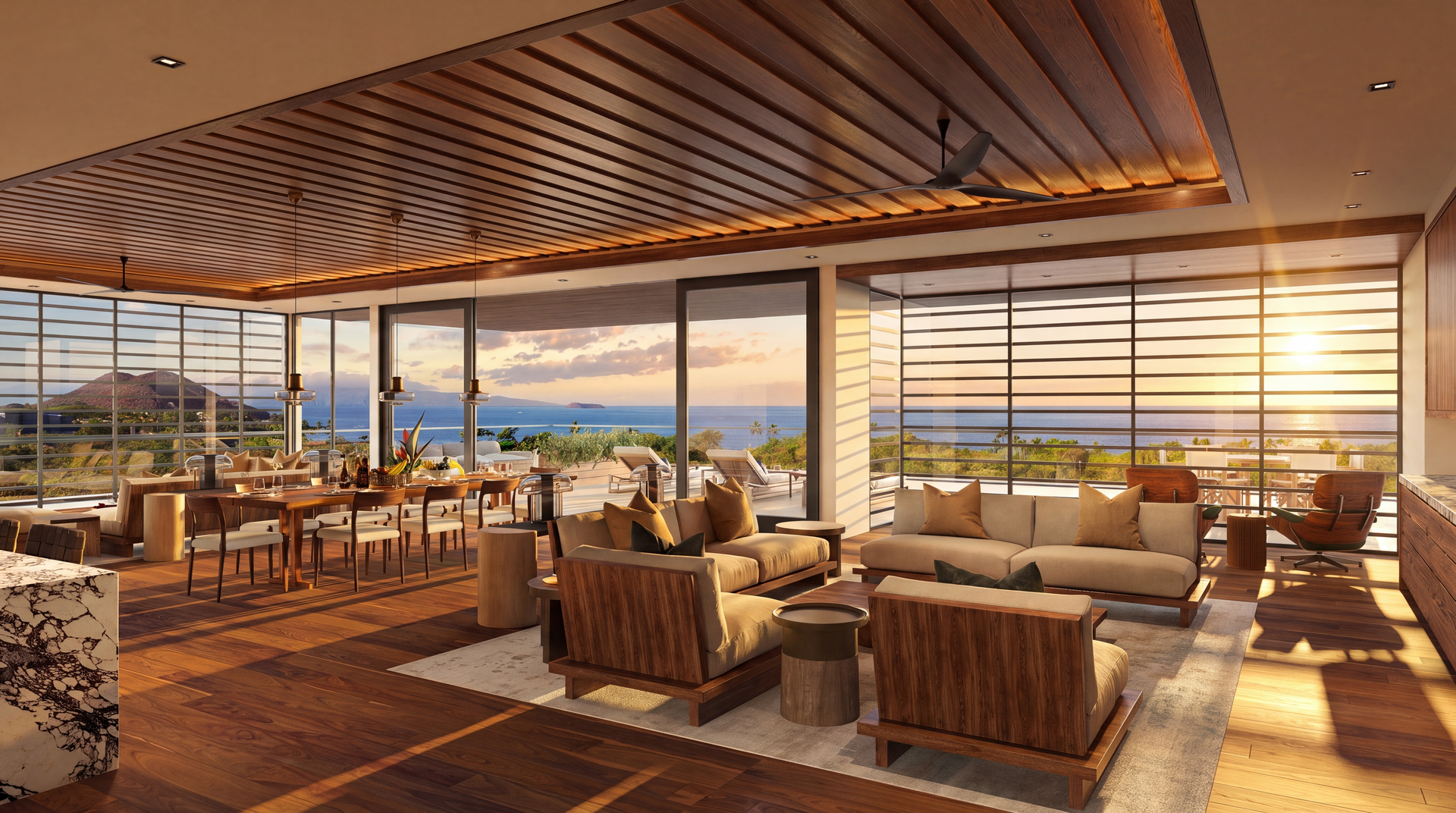
A rendered interior image builds a virtual scene. Surfaces are assigned digital materials that describe how light bounces off them. A polished marble floor reflects the room. A rough plaster wall scatters light. A brushed metal fixture sits somewhere between the two.
Those qualities are adjustable. The roughness of a surface can be dialed up or down. The scale of a wood grain can be matched to the actual board width in the specification. Reflectivity can be tuned to match a manufacturer's finish description. None of this is automatic. Reference images, product names and finish codes help the studio build a useful digital approximation. Agree on which references will guide the review.
What a rendering cannot do is replace a physical sample. Screen color is produced by light emitting from pixels. A paint chip or stone slab is seen by reflected light. The two systems do not behave identically. This is a known property of digital color management. Blender's color management documentation explains that rendering software must convert scene light values into display colors, and that conversion depends on the display profile in use. The implication is straightforward: a screen image is an interpretation, not a physical measurement. Treat it that way and it becomes very useful.
Monitor Variability and What to Do About It
One practical problem with reviewing interior architectural renderings on screen is that monitors differ. A rendering that looks warm and accurate on a calibrated studio display may look cool or oversaturated on a client's laptop. This is not a flaw in the rendering. It is a property of how screens work.
A few steps reduce this problem. Ask for a review file with a clear color profile. Heavy compression can obscure fine texture and introduce visible artifacts. A PDF alone does not make color accurate. If your team reviews the image in different locations, note the device and lighting conditions when you give feedback. A comment like "the walnut looks orange on my phone" is more useful when the studio knows it came from a phone screen in bright sunlight.
Use physical samples alongside the rendering rather than instead of it. The rendering shows composition and proportion. The sample confirms the true color. The two tools together are more reliable than either one alone.
Daylight Versus Artificial Light on the Same Finishes
The same material can look strikingly different depending on the light source. A warm limestone that reads as creamy under afternoon sun can look almost gray under cool LED downlights. Interior architectural renderings let you test both conditions without building mock-ups.
Consider a hypothetical hotel lobby. The palette includes a travertine wall, a dark oak reception desk, and a polished concrete floor. Under a midday simulation with high windows, the travertine reads warm and the concrete reads neutral. An evening version could show warmer tones under pendant lights. The exact result depends on the modeled finishes and lights. Treat each version as a proposed visual condition. Check it against the chosen samples and lighting design.
Seeing both before specifying finishes helps the designer confirm the palette holds up across the day. This kind of comparison is one of the strongest uses of interior architectural renderings. A single static image shows one moment. Two or three images of the same scene under different light show how the design performs over time.
Controlling Variables Between Comparisons
To compare materials fairly, you need to control what changes between images. If the camera angle, lighting setup, and furniture arrangement all differ from one version to the next, it is hard to know whether a finish looks better because it is better or because the light moved.
Good practice is to change one variable at a time. To compare a light oak floor against a dark walnut floor, ask for two images with everything else held constant: same camera, same light, same wall color. The eye goes directly to the floor and the comparison is honest.
The same logic applies to wall colors. Changing a wall finish while also shifting the light direction creates noise in the review. Organize revision requests around one decision at a time. It feels slower but leads to confident decisions faster.
Finish Sample Coordination
Interior architectural renderings work best when the studio has good source material. The more specific the finish information, the closer the digital material can get to the real product.
Provide manufacturer names and product codes where possible. A generic description like "white marble" has many interpretations. A specific product name narrows it significantly. If a product has a texture map or high-resolution photograph available from the manufacturer, share it. Some manufacturers publish detailed finish imagery for this purpose.
Physical samples can be photographed and sent as reference. A flat-lit photo of a tile sample gives the studio a color and texture reference. Note the finish type: matte, satin, gloss, honed, or leathered. These terms describe reflectivity and the studio will use them to tune the digital material.
For flooring, note the plank or tile size and the joint width. Grain scale matters. A wide-plank white oak floor looks completely different from a narrow-strip floor in the same species. Getting that proportion right makes interior architectural renderings more useful as a review tool. You can learn more about what the studio needs to get started in What Your Rendering Studio Actually Needs From Your Drawings.
A Hypothetical Kitchen Material Comparison
To make this concrete, consider a hypothetical scenario. A design team is specifying a high-end residential kitchen. Two palettes are under consideration. The first uses a cool white quartz countertop, flat-front white cabinetry, and brushed chrome hardware. The second uses a warm honed quartzite countertop, natural oak cabinetry, and unlacquered brass hardware.
In interior architectural renderings of this kitchen, the cool palette reads as clean and spare. Under bright task lighting above the island, the quartz has a faint sparkle. The chrome hardware almost disappears against the white cabinet faces. In an evening version, the team could check whether the white finishes pick up too much of the warm light. That is a question to test, rather than a fixed outcome.
The warm palette reads differently in both conditions. The quartzite holds its stone character under task light. The oak grain becomes visible and adds texture to the vertical surfaces. Under warm ambient light in the evening, the brass hardware reads as a deliberate accent rather than a functional detail.
Neither option is better. They serve different design intentions. But seeing them rendered in the same kitchen geometry, under the same two light conditions, gives the client and designer a shared reference point for the conversation. That is the core value of material review using interior architectural renderings.
Organizing Approval Notes
Material review tends to generate a lot of feedback from multiple people. Keeping that feedback organized prevents confusion and speeds up the revision process.
Number your comments so the studio can respond to each one clearly. Instead of a paragraph of mixed notes, try this format: "1. Can we see the backsplash in a lighter grout? 2. The countertop looks more glossy than the sample we sent. 3. Approved on the floor." That structure is fast to read and easy to act on.
Assign one person per discipline to consolidate notes before sending. Three separate emails with conflicting comments slow everything down. One consolidated document with priorities marked moves faster. Keep a log of what has been approved. As a project moves through multiple finish categories, a simple shared document with columns for approved, in review, and not started keeps the whole team aligned.
What Renderings Cannot Guarantee
It is worth being clear about the limits of interior architectural renderings in material review. A rendering is a simulation. The finished space will have real light behavior, real material variation, real surface imperfection, and real scale in a way that no screen image fully replicates.
Stone slabs have natural variation. The slab selected in the yard may be lighter or darker than the average product photo. Paint colors shift between manufacturer chips and applied wall surfaces. Tile grout changes the apparent color of the tile field. These are realities of physical construction that a rendering can approximate but not eliminate.
Use renderings to make directional decisions and confirm composition. Use samples, mock-ups, and site visits to confirm the physical reality. The two tools work together. Neither replaces the other.
If you are early in the process and want to understand how visualization fits into the broader project budget, What Does an Architectural Rendering Cost? A Straight Answer provides useful context.
Making the Most of the Review Process
Interior architectural renderings are a practical tool for finish review when used with clear intentions. Know what question you are trying to answer with each image. Control variables between comparisons. Provide specific finish information. Organize feedback carefully. Use physical samples alongside the screen images.
The result is a review process that is faster, cheaper, and less stressful than discovering material conflicts after installation. Interior architectural renderings will not make every decision for you, but they will make the right decisions easier to reach.
If you have a project with complex material choices and want to talk through how visualization can support the review process, start a conversation with Jeff Brink.
Practical checklist for material review using interior architectural renderings:
- Provide manufacturer names and product codes for each finish
- Share high-resolution reference photos or texture maps where available
- Note finish type: matte, satin, gloss, honed, or leathered
- Specify plank or tile dimensions and joint width for flooring
- Request separate renders under daylight and artificial light conditions
- Change one variable at a time between comparison images
- Keep camera position and lighting constant between finish options
- Consolidate team feedback into one numbered document before sending
- Note the device and screen conditions when reporting color concerns
- Keep a running log of approved, in-review, and open finish decisions
- Use physical samples alongside the rendered images throughout the process